BLOG: Colour Psychology and Emotional Connections
Colour Psychology and Emotional Connections – by Ali Cao
“I’m not too sure if I need it…”
“I’m not too sure of the fit…”
“Maybe if they had it in a different colour…”
It might surprise you to know that 80% of our decision making, whether or not to buy a product or service, is based on an emotional connection. Linked with that, the use of colour can have a huge influence on our emotions. In fact, recent surveys found that colour was the defining factor in a person’s buying decision!
Great news if you are buying a kettle, car or new top for the weekend, but how do you unpack that minefield when you’re a business selling a product or service? How can you use colours to help you create an emotional connection with your audience?
Direct Mail
Every day we all pick up post from our doormat and sift through the array of white, brown and manilla envelopes, the takeaway menus and flyers. There was a moment when we thought that mail was diminishing but is it just me or has that picked up again recently!?
When was the last time a piece of post really caught your attention and made you want to open it? If direct mail is part of your marketing strategy, how do you make sure your piece of mail doesn’t get ignored with the rest?
We always recommend personalisation as a key part of making sure your mail gets opened. On top of that, using a coloured envelope is a brilliant opportunity to really grab the attention of the recipient and make them want to open it, eager to see the contents of this ‘different’ and exciting piece of post.
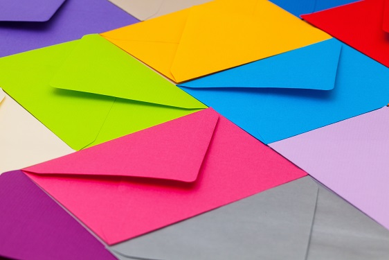
Research has found that a coloured envelope has a 40% higher open rate than a white or manilla one. Let’s face it – bills don’t normally come in anything as appealing as coloured envelope, do they?
People often ask:
“Should the colour of my envelope reflect my brand colours?”
Our advice would be not to get too hung up on making sure your envelopes match your brand colours. Focus on the mood and connection you want to create to ensure your direct mail marketing is memorable.
Choosing the Right Colour for You
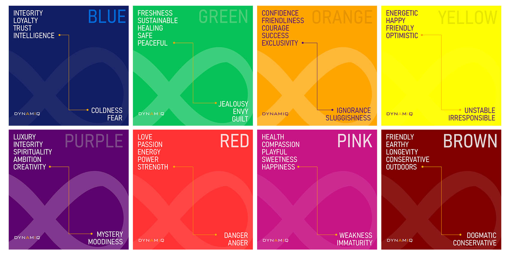
When it comes to choosing the right colour, it pays to think about the tone of your message. What kind of emotional response are you wanting from your recipient?
- Orange and yellow are great colours to create a happy excitement.
- Shimmering silver creates a particular sense of luxury.
- Red communicates a sense of urgency,
- Blues are renowned for reflecting trust and security.
- Wanting to add a touch of romance? Then pink is definitely the colour to choose!
- Or simply give an air of calm and relaxation using green.
What next?
So, you’ve made a great first impression with the colour of your envelope and your direct mail has put a smile on the recipient’s face. But how do you get them to respond?
Using a Call to Action is a marketing must in every single communication. These staggering statistics help to explain why:
- More than 90% of visitors who read your headline also read your call-to-action copy. (Unbounce)
- Emails with a single call-to-action increase clicks by 371% and sales by 1617%. (WordStream)
- Adding call-to-actions to your Facebook page can increase click-through rate by 285%. (AdRoll)
Make sure you include a Call-to-Action with every communication. Make the information clear and easy to read within the text and use the colour psychology to give your audience the right message behind your call.
Try and experiment with different colours. Don’t forget – always measure your results. If you don’t, how will you know how your campaigns are performing!?

Find out more about Ali here.